
Making the invisible web feel like something you can hold.
Atlas & Ivy designs and builds the systems businesses use to power stellar customer experiences on the web. Their work is deeply technical, but the people behind it are warm, curious, and obsessed with craft. The old brand said none of that.
We built an identity around structures in nature: fungi, beehives, fingerprints, and organic forms becoming intricate systems. That idea shaped a modular mark, a tactile texture library, and a visual world that can move from disciplined black and white to vivid color.

A mark that behaves like a system
The symbol is both an ampersand and an icon: a compact network of interlocking parts. It stays recognizable at app-icon scale, then opens into a family of patterns, pathways, and motion behaviors when there is more room to play.
The restraint is intentional. Every element has a job, every connection has a reason, and the identity never competes with the sophisticated work it represents.
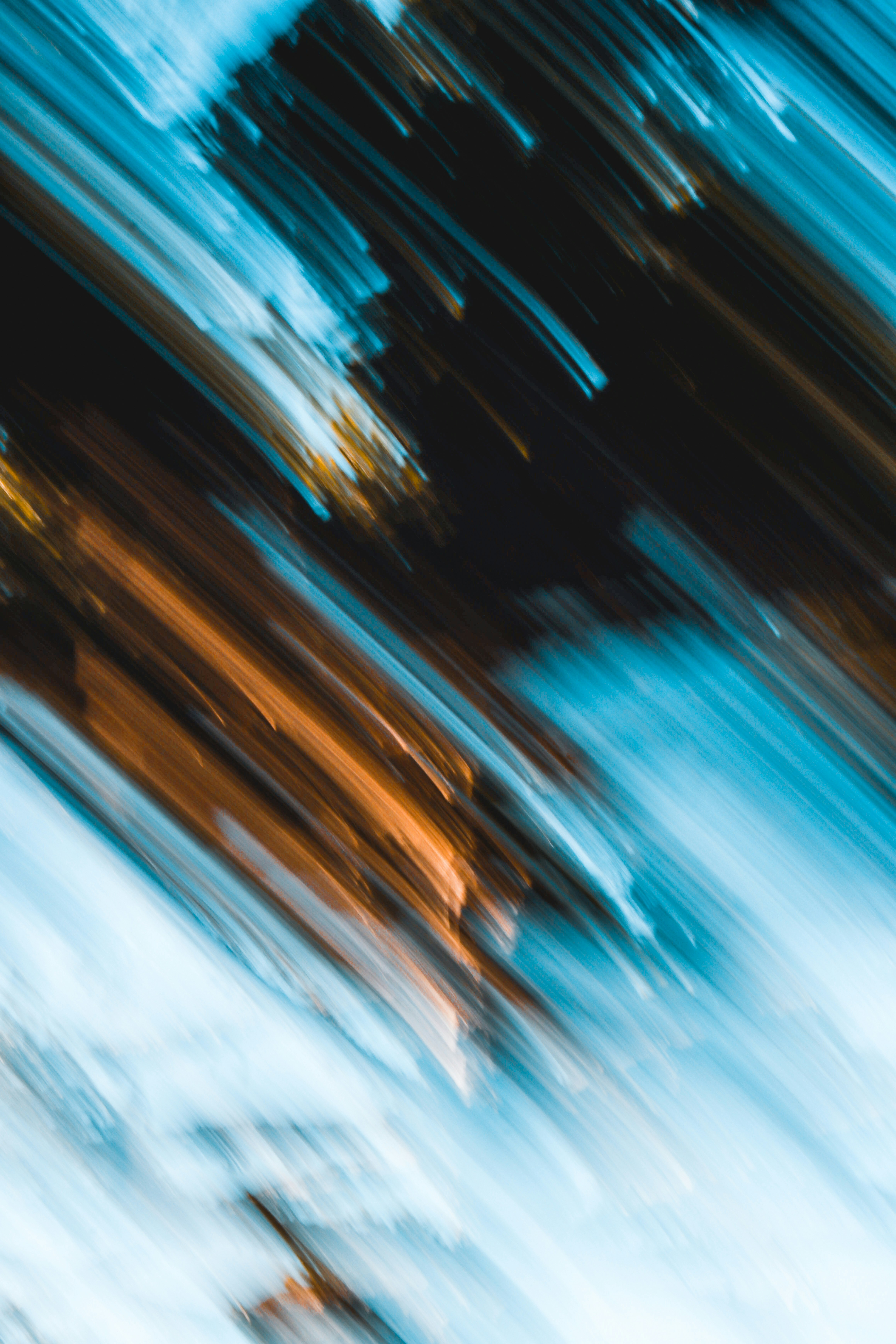
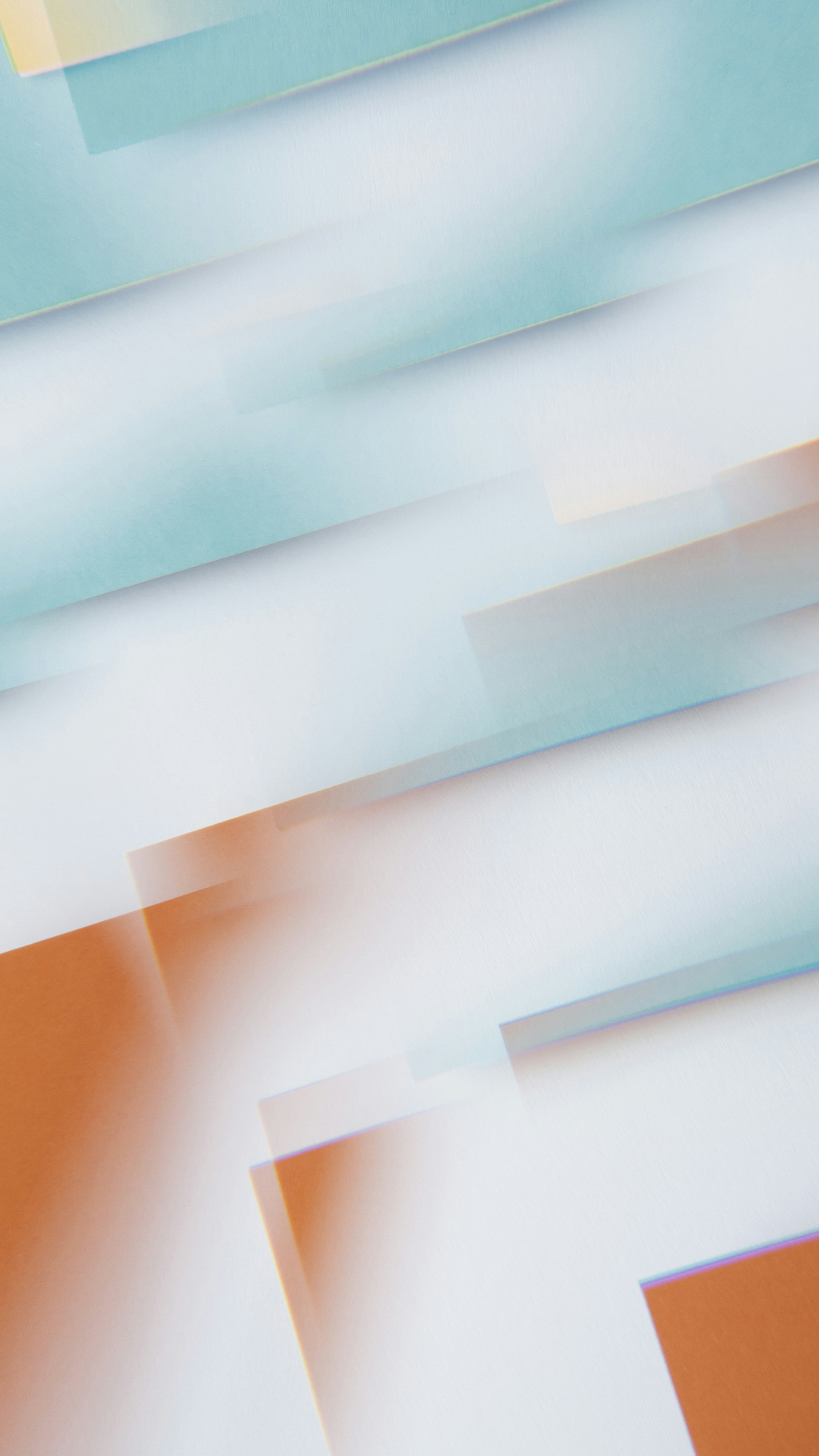
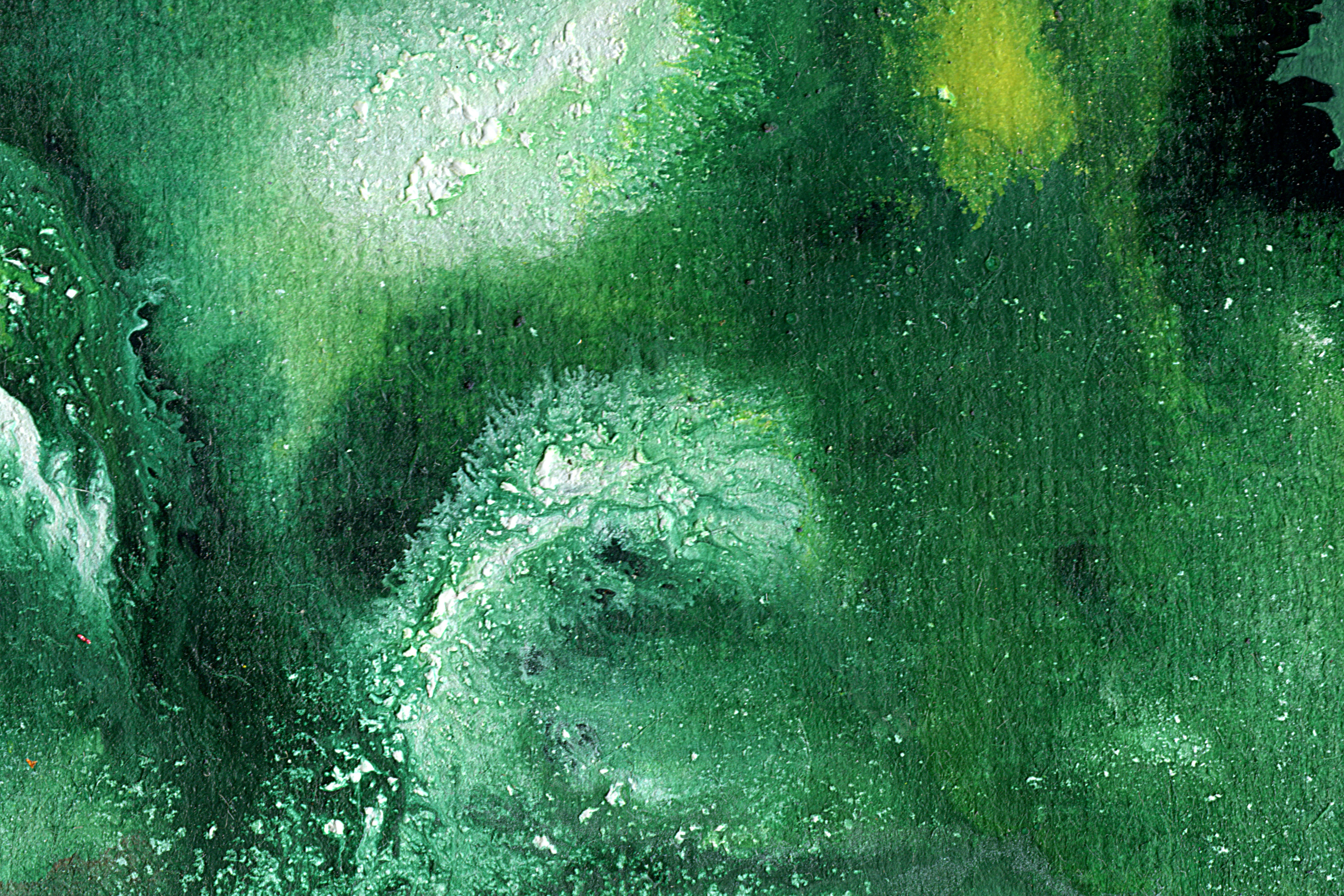

Complex systems can still feel clear, tactile, and alive.
Color, pattern, and texture
The expressive layer borrows from microscopy, refraction, and natural repetition. Cropped textures and high-contrast color make the technical work feel dimensional without pretending it is simple.
A flexible palette gives each story its own atmosphere while the typography and icon system keep every touchpoint recognizably Atlas & Ivy.
A website built to explain the hard stuff
The new site balances technical depth with a clear editorial rhythm. Modular case studies, generous type, and moments of visual surprise let engineers evaluate the thinking while giving leadership an immediate sense of the partnership.