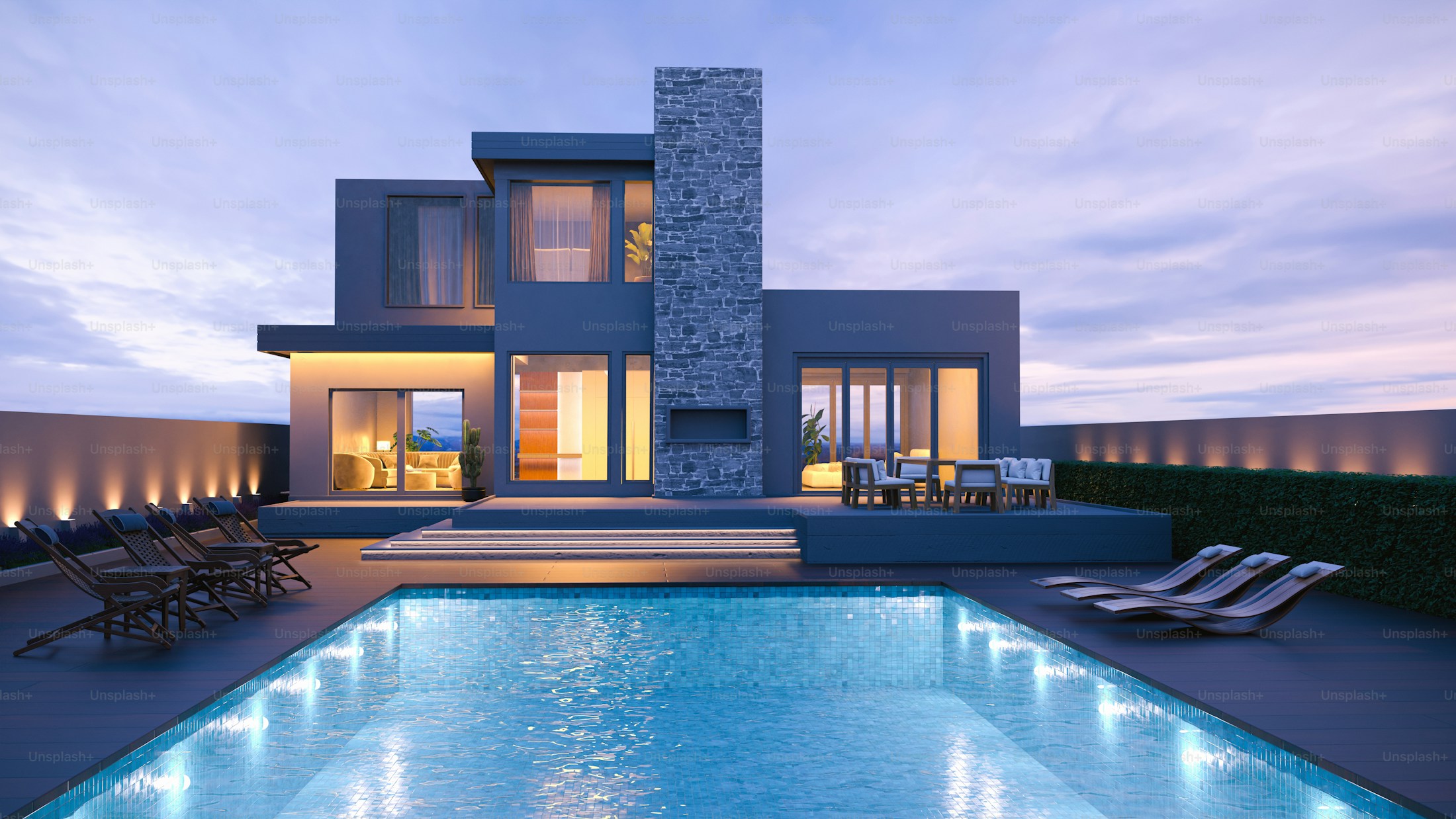
The intersection of collaboration and craftsmanship.
Ridgeline builds a handful of homes a year, each one considered down to the last hinge. Their reputation was strong, but their brand looked like every other contractor's. To reach the right clients, the identity needed to carry the same weight as the work.
We centered the brand on an understated sense of place: warm, architectural, and confident enough to leave room for the homes. The system feels at home on a job-site sign, a set of plans, or the desk of a future homeowner.
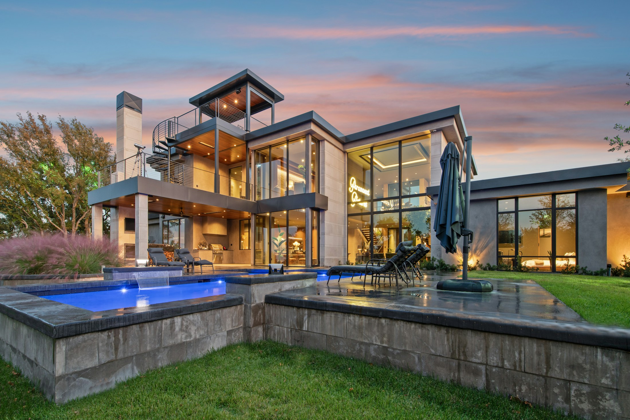
Luxury homes built at the intersection of collaboration and craft.
Friendly luxury
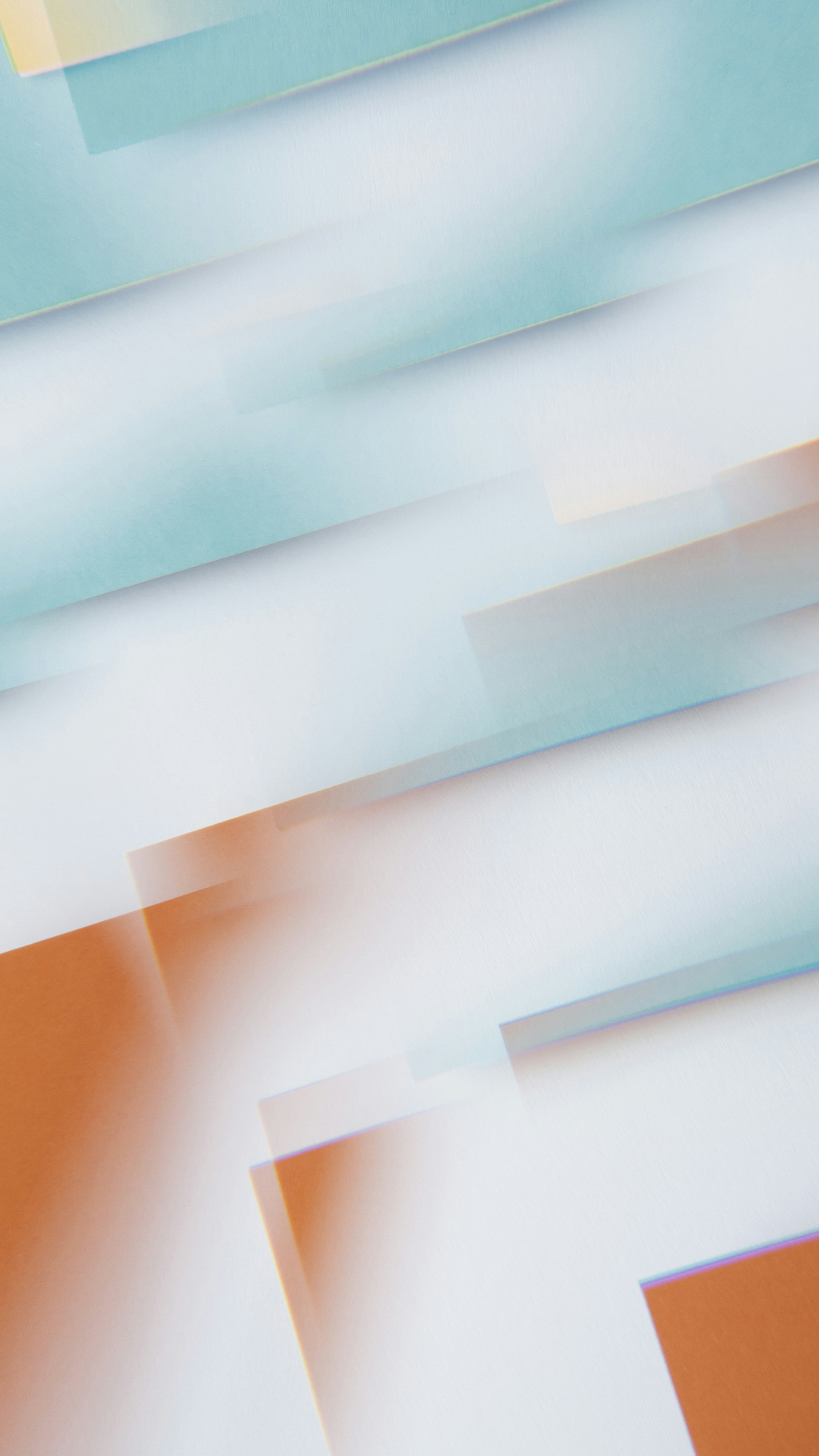
The brand needed to feel elegant and approachable, encompassing the quality of the builds, the boutique experience of the team, and the innovation and collaboration brought to every project.
A refined serif wordmark and disciplined supporting type do most of the talking. Warm rust, soft cream, charcoal, and natural imagery keep the system grounded in the landscape.
A plot device
Every Ridgeline home begins with its land. The visual system follows that idea with an adaptable frame: a simple geometry that can crop photography, hold a message, or guide the eye through a page.
Like a floor plan, the frame creates order without prescribing the outcome. It becomes a flexible architecture for proposals, signage, social stories, and the website.
The website
The website follows the rhythm of the brand, pairing generous imagery with concise, useful storytelling. We developed a modular editorial system that makes every project feel distinct while keeping the experience calm and consistent.
Large photographs reward inspection. Quiet details, clear process language, and restrained transitions reinforce the care clients can expect long before construction begins.